We have seen Material Theme Redesign in a number of apps such as Gmail, Google Drive, Facebook and now its time to use the new material theme in the Google Play Store. The layout of the app plays an important role while using the app. According to XDA, the latest Google Play Store Version 14.5.52 has a new material theme. Let’s see what are the changes in the Google Play Store Material Theme Redesign.
Google Play Store v14.5.52 Material Theme
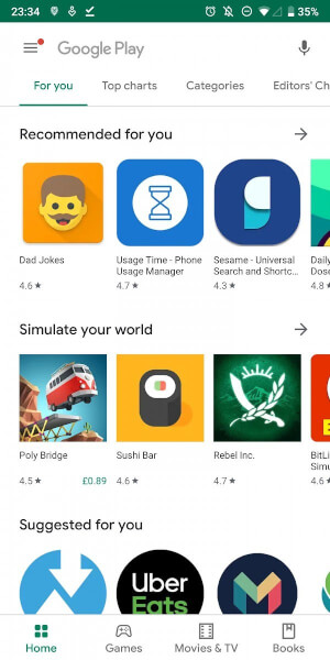
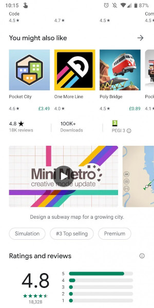
As you can see in the screenshots shared by XDA, the redesigned material theme is very minimal. The green colour on the top bar is completely gone and everything is in white colour now.
-
-
New Homepage
-
-
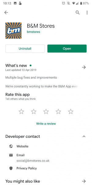
App Install
-
-
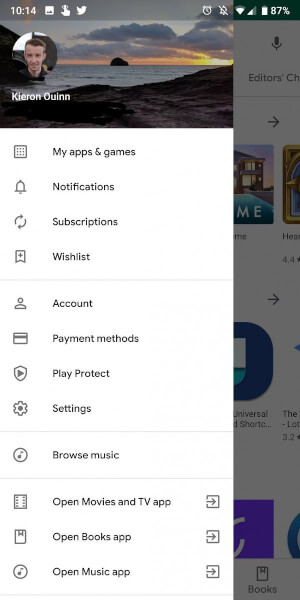
Menu
What’s New
There are so many material design changes in the Google Play Store.
- First of all, Google is implementing Google Sans font in every app including Gmail, News Feed, Google Drive and the Play Store is no exception. The new Google Sans Font is here on the Play Store.
- A new bottom bar is added which contains Home, Games, Movies & TV and Books. It is a significant change. They are now easily accessible, especially in bigger screen smartphones. It is now easy to navigate between them.
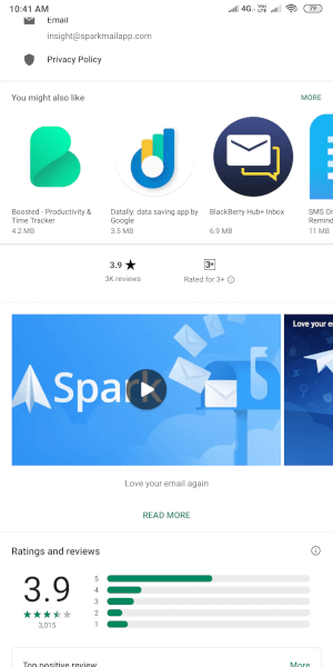
- Instead of the size of the apps, the new material theme shows the Rating on the home page.
- Install button is now with rounded corner.
- More button is now replaced with an arrow to free some space.
- The new material theme focuses on what is most important, so the Install button is now big.
- The menu page is redesigned too. All the icons are minimal and monochrome in the latest update. Also, there is one Browse Music option is added for Google Play Music or Youtube Music.
- The horizontal line between apps is removed in My apps & games section, to give a more minimal and clean look.
The Movie & TV section is changed and the new material theme redesign applied to the Books section as well.
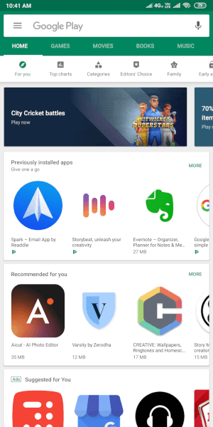
Old Vs New Layout
-
-
Older Homepage
-

-
New Homepage
-
-
App Info Old
-
-
App Info New
As you can clearly see in the screenshots that the new Google Play Store Material Theme Redesign looks more minimal and gives a clean and fresh look. This new design is not available for every user right now. Google is testing this material theme. The new update will soon roll out for every user in the upcoming weeks.
Stay tuned with us to get the latest update of the technology world.
(Source)