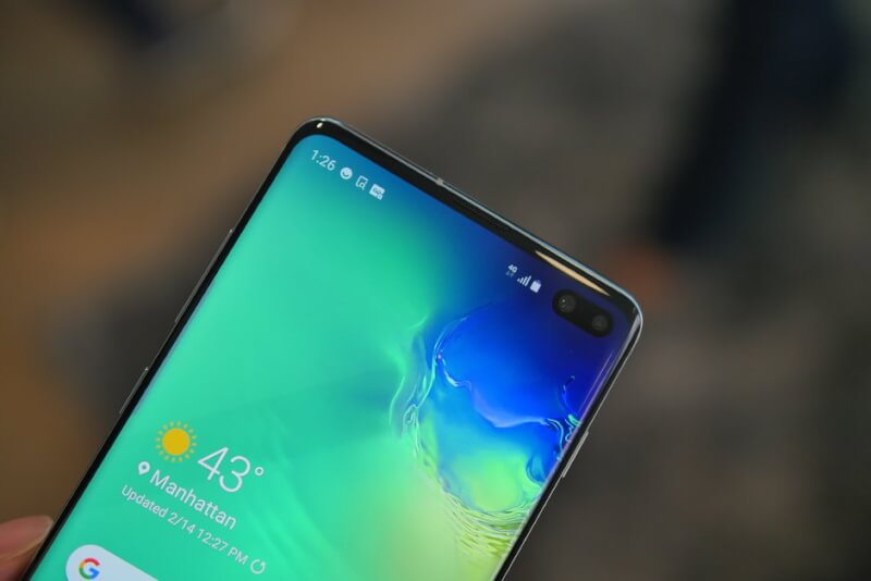
It’s been only a year and a half since iPhone X was launched and the Notch “Trend” started. However, the Essential Phone (PH-1) and Sharp Aquos S2 were one of the first smartphones to feature a notch but they were widely unpopular. The Hole-Punch first appeared in Huawei’s View 20 Pro. So in this article, we are going to talk about the reasons why we hate the notch and the new hyped up Hole-Punch displays. I know many readers will disagree with these views but read the complete article before starting a protest 😀
The Obsession with a Bigger Display
There was a time when the 5.3-inched Galaxy Note I was criticized for being too large for a smartphone but as it was a Samsung flagship device, people bought it for other features like the S-Pen. You should read its reviews and you’ll be shocked to know that it was pushed over to the Tablet side and wasn’t considered a phone by some websites like the Verge. Looking at its popularity other smartphone manufacturers also started launching smartphones with 5+ inch displays and these smartphones were called ‘Phablets‘ (Amalgam of Phone and Tablet).

Why does the Notch Exist?
As time passed people started getting used to this 5 plus inch screen size. Smartphone manufacturers like Samsung found a way to increase the screen size by chopping off the top and chin of the devices giving a better aspect ratio without increasing the size of the body. Introducing the new displays with 18:9 ratio. These 18:9 aspect ratio displays came to the market in the Samsung Galaxy S8/S8+ and LG G6 which was later seen copied by budget smartphones like Redmi Note 5 and Honor 9 Lite.
In the same year as the S8, iPhone X was launched with the ugly wide notch which was again imitated by many smartphones launched throughout 2018. You will hardly find a smartphone without a notch nowadays. The notch exists because Apple created it and other brands just sheep mindedly followed.
Advantages of a Notch/Hole-Punch
The notch or hole-punch display provides a slightly more aspect ratio and the screen-to-body ratio at the cost of decent Video watching and Gaming Experience. It also houses the front camera, speaker grill, and flash. Anyone who has used a smartphone with a notch or Hole-Punch says things like ‘You get used to it” or “Your mind automatically starts to ignore it after a week of usage”. But do we really need to get used to or subconsciously ignore it? Just remove that notch already and give us a symmetrical phone.
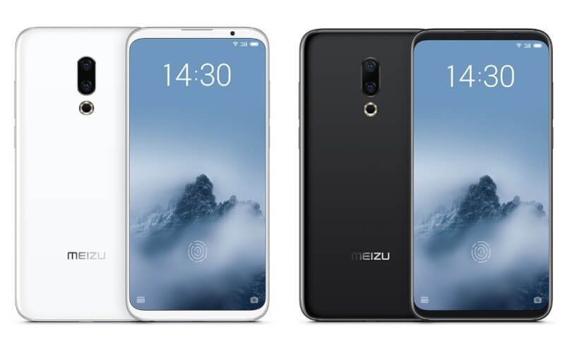
For reference, look at this smartphone right here:

Image: Meizu 16th
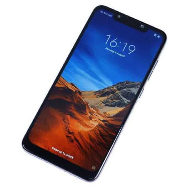
See symmetry? Notice how good it looks compared to this:

Image: Poco F1
I know the price difference between these two devices is almost double but the design of the former is simple and basic compared to the latter. It’s not like Brands can’t implement the Meizu 16th’s design because it increases the cost of the device and hence decreases the profit. Simply adding a thin top bezel which you are trying so hard to minimize with the notch or the Hole-Punch or by a pop-up camera provides a better overall design.
Problems with the Notch and Hole-Punch :
- Bad Video Watching Experience: Some parts of the video will definitely hide behind the notch or the hole when watching a full-screen video. You can zoom out videos on Youtube but that defeats the whole purpose of having the big screen.
- Bad Gaming Experience: Ever played PUBG on a phone with a notch? You have to shift the controls a little away from the notch which ruins the whole experience as you’ll be slightly shifted towards the right or left on the screen. The hole punch doesn’t make us shift the controls as much but still acts as a distraction.
- Design/Looks: We have already talked about this in the above section. Symmetrical things look beautiful but we have been forced to be okay with this Notch Trend just like all the other trends.
- Horrible Implementations: Have you seen the notch on Pixel 3 and 3XL? It looks like a bathtub. They reduced the width but increase its height. It is undoubtedly the worst implementation of a notch.
- Weird Aspect Ratios: 16:9 used to be the standard aspect ratio before Samsung S8 and LG G6 came with the taller 18:9 ratio which was cool but notches introduced ratios like 18.7:9 and 18.5:9.
- Can’t Operate the Screen where the Notch is: If you use a custom ROM, there’s often this feature called ‘Slide to increase brightness’. You need to slide on the notification panel to control the brightness which is not possible when there’s a cut-out in front of the notification bar.
Yes, the hole-punch is slightly better as compared to a notch in many terms but it still distracts and looks awful when compared to the devices having a couple of identical Top and Bottom Chin.

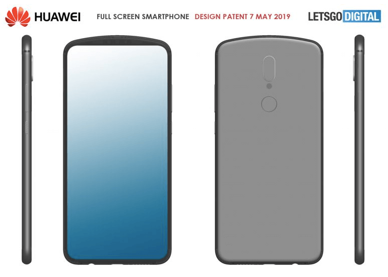
This is how Huawei plans to eliminate the notch. Looks good to me 🙂
Conclusion
Notches are definitely a phase between thick bezels and no bezels. Although they don’t need to exist, they do because of the lack of research & creativity of smaller brands who just copy or modify everything Apple does. What’s better than a notch or hole-punch? Right now, a design like Meizu 16th with even lesser bezels would be the best or the pop-up camera with no chin. The future does hold the possibility of hiding the camera under the display which will result in a totally bezel-less smartphone from all angles. Huawei also patented a design (In above pic) that is a great step towards eliminating the notch and hole-punch.
That’s all for Today! This article was my own personal opinion and I would love to hear yours in the comments! Stay tuned for more!